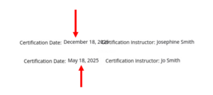
If you are designing your certificate and have multiple merge fields interspersed with static text, it can be challenging to line these fields up to display correctly. This is because variations in the length of your merge fields can cause text to overlap, be to short, or otherwise not format correctly on your certificates. Here’s an example of how difficult that can be when trying to line up multiple fields:
Within the Builder, multiple merge variables are lined up next to static text. Note in this example, both “Date” and “Instructor” are Merge fields that are placed next to independent static text fields (“Certification Date” and “Certification Instructor”:
When data is imported into these merge, depending on how much text is in each merge field, this can cause text to not line up, overlap, and be difficult to read. It’s hard to correctly line up, and never looks correct:
A better way to design this is to instead insert your Merge Fields INTO a single, static text field. This allows all text that will be displayed to be properly aligned. Regardless of how much text is in a merge field, it will always format correctly because it’s contained within a single field. Below is what that would look like from the builder. Note both of the merge fields, PLUS the full static text is now inserted within a single text field:
When data is imported into the merge fields, it now wraps correctly and is perfectly aligned, regardless of length (make sure your text field is wide enough to accommodate the full text):
To insert a merge field into a static text field, first add the static text that you wish to add, and then while you cursor is still clicked into that field, select “Insert [Merge Field] “. A new merge field will then be placed into your static text field, exactly where you cursor is located.


